Big Screen Mobile Navigation
- 11th February 2016
- Tutorial
Since the inception of Responsive Web Design, the evolution of the mobile menu has been interesting to observe. Early mobile menus converted links into a form-style ‘select’ option. This moved to ‘toggle’ menus, where links are hidden until the user chooses to open them, and ‘footer’ menus where the user clicks an icon at the top of the page to take them straight to the navigation in the footer of the page.
Despite each working well for different types of website layout, we felt that they were not catering to the devices they were intended for and how those devices were usually operated in the real world.
So What is the Problem With Existing Mobile Navigation?
There is no denying that mobile phone screens are getting larger. Samsung’s latest Galaxy S6 Edge+ has a 5.7″ display, HTC’s M9 handset has a 5″ display, LG’s flagship smartphone, the G4, has a 5.5″ display and even Apple has got in on the large screen act (despite resisting for a long time) with the iPhone 6 Plus sporting a 5.5″ display.
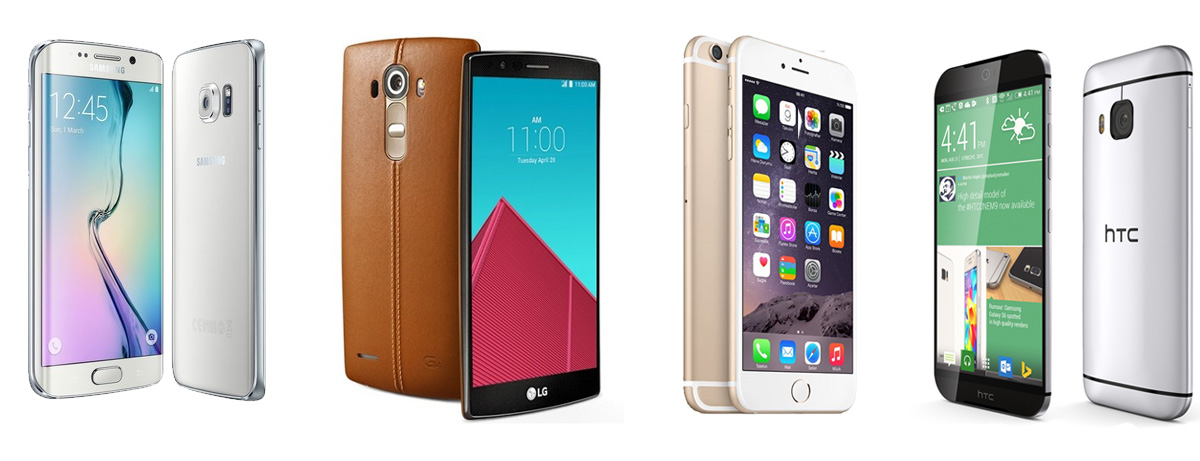
A lot of mobile navigation solutions use ‘triggers’ (such as the popular ‘burger’ style icon), to activate or show the menu, located top right or sometimes even top left of the website. This can result in a ‘thumb-cramping’ stretch to navigate the website on big phones.
How are Users Operating Their Mobile Devices?
It would have been very easy for us to make some assumptions about how users operate their devices and surf the internet, so we took a straw poll of family, friends and unsuspecting folks we accosted in the street to get some answers. Our selection of respondents was modest but the consensus was what we had expected; desktop and laptop owners still opt for a mouse or trackpad, tablet owners will usually hold the device in one hand and navigate with the index finger of their dominant hand and mobile phone operation tends to be one-handed and primarily using the thumb on that hand to touch the screen.
Assessing Hot-spots and Reach-points on Larger Screens
As well as having a good look at our own devices and how far our little digits will span across the screen, we found plenty of resources online to help identify where the reach-points and hot-spots are on larger screens.
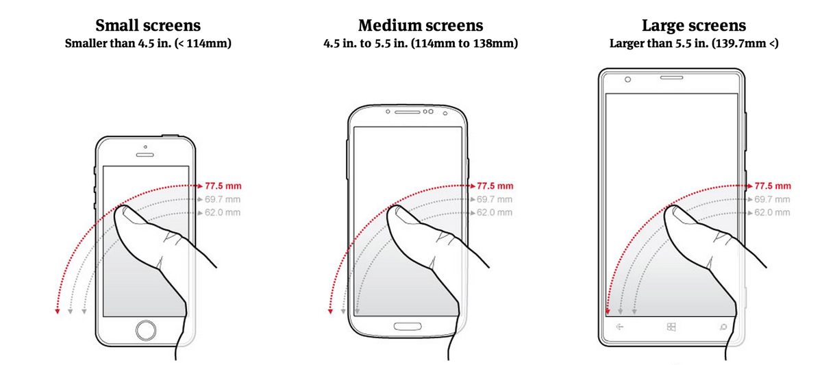
Image courtesy of 9to5mac.com
This image demonstrates the issue very well. You can see that with the iPhone type screen (below 4.5″), the trigger for the menu toggle can be reached fairly easily with a thumb. The 4.5″ to 5.5″ screen immediately takes the menu trigger out of the one-handed user’s comfort zone and the 5.5″ plus handsets require some serious hand gymnastics to reach… So why do we still place triggers at the top of the screen? Phone manufacturers realised this a long time ago and ‘dock’ your most used apps (such as calls, text, email) at the footer of the handset’s screen so why, as web developers, do we seem to ignore this screen space altogether?
Desktop – If It Ain’t Broke, Don’t Fix It
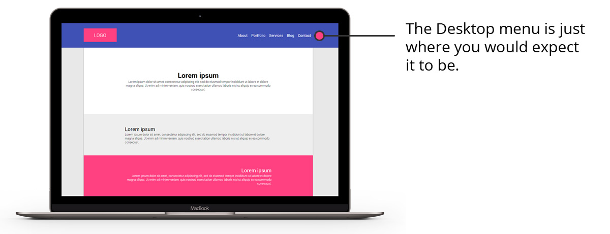
Most of us expect to see the main navigation of a website at the top of a page on the desktop layout. So that’s where we kept it. Move along please… nothing to see here!
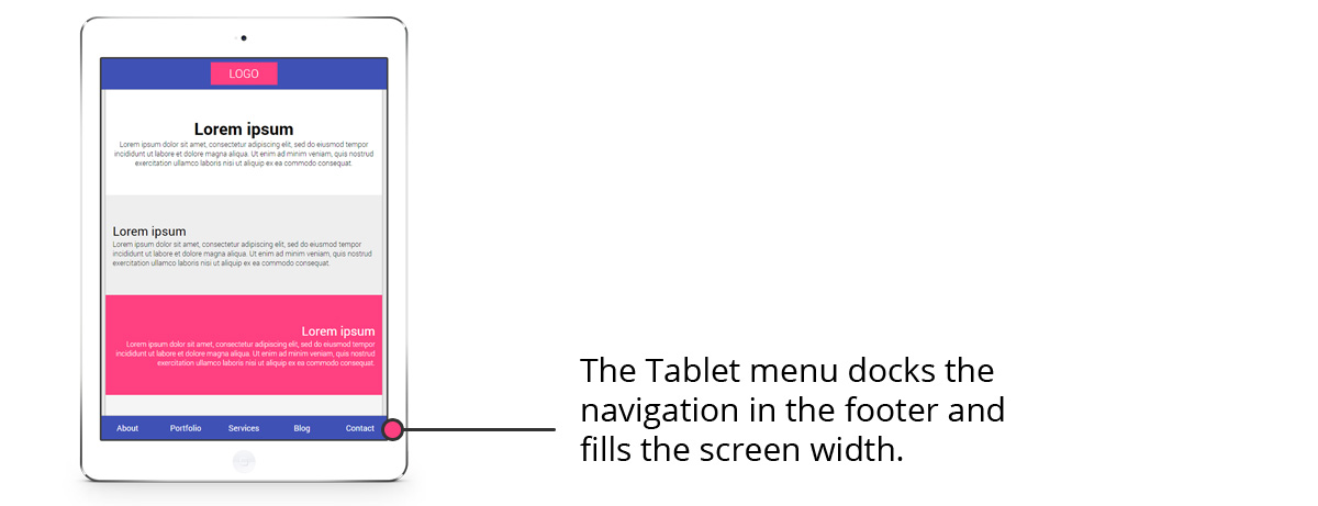
Tablet – Full Footer Menu
The tablet menu shifts the navigation and ‘docks’ it at the bottom of the screen. Although the issues with navigation are not the same on tablets as they are on mobile (remember we found that tablets are usually operated with two hands) we did feel that the menu feels more natural nestled at the bottom of the tablet, especially when reading in portrait mode.
Mobile – Biting The Burger Back
So here is where the real changes are! Firstly, we have ‘ditched the burger’. Controversial we know, but the up and down chevrons just seemed to make more sense as the menu expands upwards when clicked and retracts downwards again when hidden. The trigger sits right in the middle of the navigation, which is where the ‘Home’ buttons can be found on both iOS and Android, and is well within the reach of a user’s thumb.
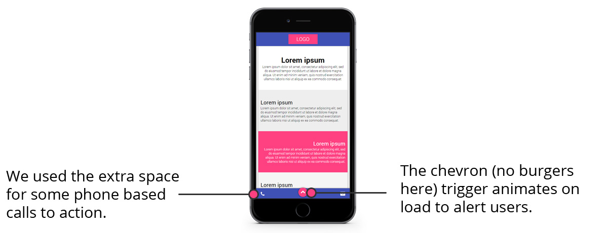
Next, we have used some of the spare space on the fixed operation bar to display a couple of key ‘calls to action’ (in this case a ‘call’ button and an ’email’ button) to allow visitors to quickly call or email the owner of the website. We could just have easily included a link to Google Maps or some Social Media links. These mimic the docked apps on the phone’s operating system and so it seemed like a logical place to find them. We hope that this will help conversion rates on mobile devices, but that remains to be seen when this menu is implemented in a project.
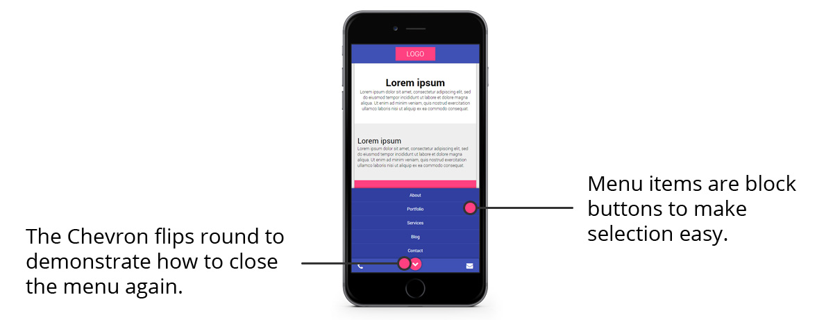
Finally, we know that users can take a while to catch on (and the burger is now pretty well recognised as the default symbol for the menu trigger) so we have added a simple ‘bounce’ animation on our chevron trigger to alert the user that more goodies lie beneath!
Some Limitations
OK, so nobody is perfect and we know that this approach will cause issues with longer menus and menus with complex structures and sub-menus. We do know that it can comfortably accommodate up to six key links (and maybe more), which should be plenty for most brochure-style websites.
We are also aware that our menu may, in extreme cases, end up clashing with the operating system menus docked at the bottom of the screen. We have tried to mitigate this as much as we can with large buttons and some cheeky extra padding here and there. We think you would have to be in possession of some fairly chunky thumbs to accidentally hit both menus!
Try it Out
Here is our creation on the CodePen website (click here to view this full-page).
See the Pen The User’s Responsive Menu by Yoto Creative (@yotocreative) on CodePen.
We had a fair few madcap ideas (such as asking the user if they are left or right handed) through the development stages of this project but finally we think we have come up with a menu that tackles the ever-increasing onslaught of massive screens head-on whilst also considering how users operate both tablets and PCs to navigate websites. We dropped some of the more crazy suggestions and this is where we are today.
If you think the menu could be improved on or are using it in a project of your own then we would love to hear from you via our Twitter Account or Facebook Page. And please don’t forget to share this article with other progressive UX designers!