Improve User Experience on Your Mobile-Friendly Website
- 17th November 2015
- Tutorial
When considering Responsive Web Design, it is easy to forget that the environment where the website will be viewed has a large part to play in the user experience. We often see ‘mobile-friendly’ websites that ‘pass’ the Google Mobile Usability Test but do not go nearly far enough to engage the visitor on their chosen platform or make their website experience as simple and pleasurable as possible.
In this article we delve into five of our favourite mobile-friendly website features.
Interactive Phone Number
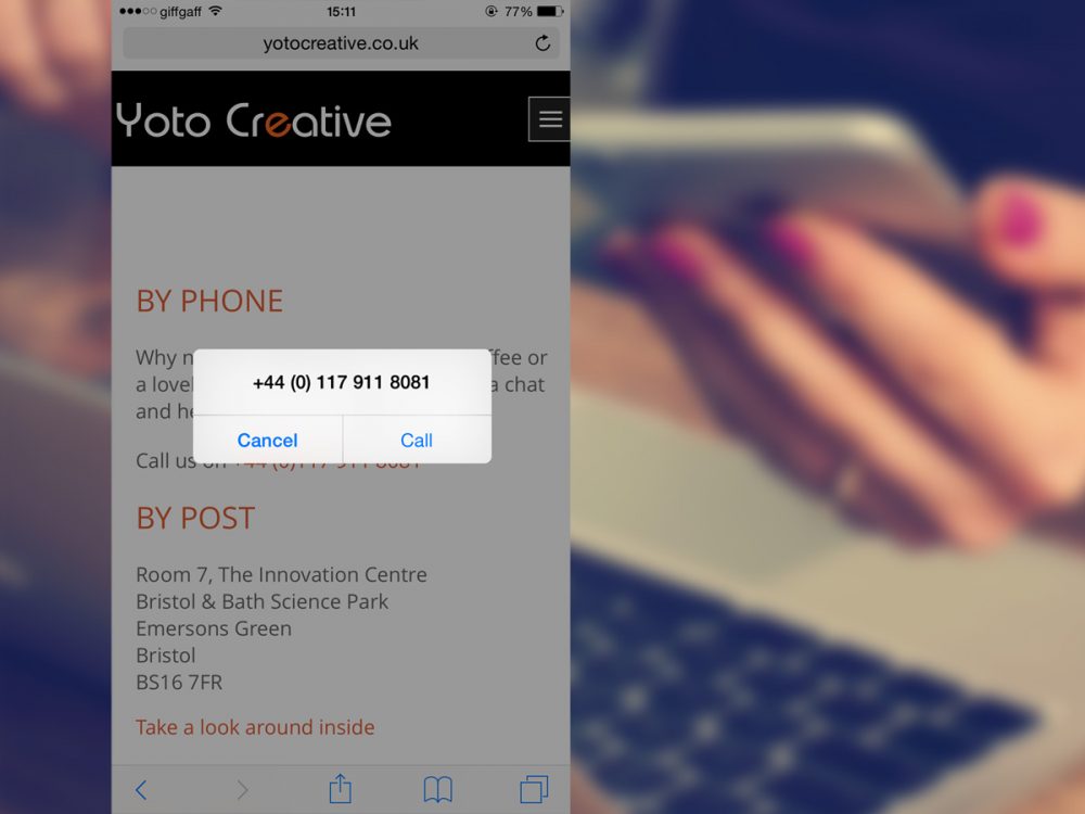
It stands to reason that a customer surfing your website on a mobile phone may be looking to give you a call. Although it is becoming widely support as a ‘built-in’ feature for a lot of phone/tablet operating systems, it isn’t on every device just yet so adding it can be a great help to some of your visitors who are looking to get in touch with you as quickly as possible.
To do this, take a look at the code below:
<a href="tel:+441179118081" title="Call us today!">0117 911 8081</a>When tapped on, this will bring up a dialog box, the user can then choose to proceed to call you or cancel the request. This simple piece of code will make sure that your visitors can dial your phone number for an enquiry straight from your website.
Telephone Number Input Field
Another simple modification you can easily add is the telephone input field on your contact form. Instead of a standard text field, which will bring up your phone’s alphabetical keyboard, tapping on a telephone input will toggle a numeric pad.
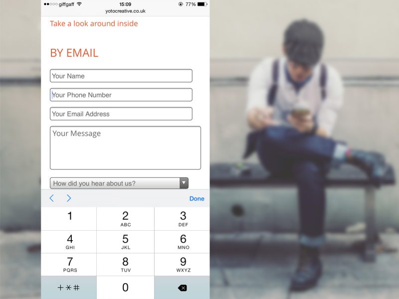
This makes it much easier for the end user to enter in their phone number on a mobile device.
You can add this input yourself by using the following code:
<p><input name="telephone" type="tel" placeholder="Please enter your phone number here"></p>Not only will this save the end user time, but save them from accidentally hitting the wrong key as the numeric pad is a lot larger and more accessible.
Postcode to Google Maps
So you’re displaying your address on your website? Great, your audience can now copy and paste your address into Google Maps to find you. But have you ever tried to copy/paste an address on your phone or tablet? It’s not too difficult, but it’s a hassle. So why not make it a little easier by allowing the user to interact with the address and open your location in the Google Maps app on their phone?

You can do this by visiting Google Maps and locating your business address. In the top left of your screen you’ll notice a hamburger (three horizontal lines). Clicking this icon will bring up extra options. Look for the ‘Share/Embed’ option and copy the share URL. Now all you need to do is turn this into a hyperlink on your address.
For example:
<a href="https://www.google.co.uk/maps/place/Windmill+Golf+Academy/@51.5038826,-2.4637788,16z/data=!4m2!3m1!1s0x0000000000000000:0xf417cf47a8bca90b" target="_blank">BS36 2FE</a>Add to Home Screen Icon
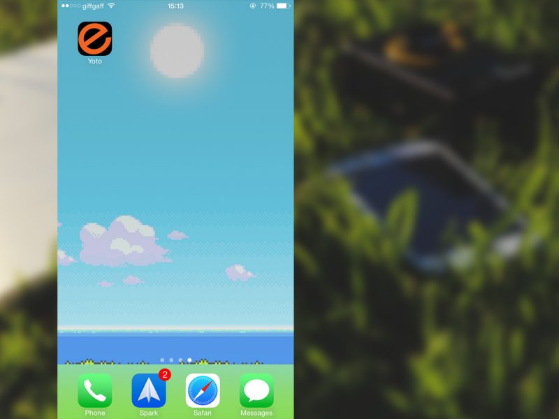
Ever heard of Favicons? They are the little icons that appear on your browser tab and to represent your website under a user’s browser ‘favourites’. With mobile devices, users can now choose to add your website to their ‘Home Screen’, and there are now options for sharp looking icons on these mobile devices.
To ensure you get the best possible quality across every platform, you can serve multiple icons in a range of different sizes. The device can then choose the icon that best suits the operating system.
To do this, you can take advantage of this great website here which will generate everything you need for you.
Here is example code for range of Favicon options:
<link rel="apple-touch-icon-precomposed" sizes="57x57" href="apple-touch-icon-57x57.png">
<link rel="apple-touch-icon-precomposed" sizes="114x114" href="apple-touch-icon-114x114.png">
<link rel="apple-touch-icon-precomposed" sizes="72x72" href="apple-touch-icon-72x72.png">
<link rel="apple-touch-icon-precomposed" sizes="144x144" href="apple-touch-icon-144x144.png">
<link rel="apple-touch-icon-precomposed" sizes="60x60" href="apple-touch-icon-60x60.png">
<link rel="apple-touch-icon-precomposed" sizes="120x120" href="apple-touch-icon-120x120.png">
<link rel="apple-touch-icon-precomposed" sizes="76x76" href="apple-touch-icon-76x76.png">
<link rel="apple-touch-icon-precomposed" sizes="152x152" href="apple-touch-icon-152x152.png">
<link rel="icon" type="image/png" href="favicon-196x196.png" sizes="196x196">
<link rel="icon" type="image/png" href="favicon-96x96.png" sizes="96x96">
<link rel="icon" type="image/png" href="favicon-32x32.png" sizes="32x32">
<link rel="icon" type="image/png" href="favicon-16x16.png" sizes="16x16">
<link rel="icon" type="image/png" href="favicon-128.png" sizes="128x128">
<meta name="msapplication-TileImage" content="mstile-144x144.png">
<meta name="msapplication-square70x70logo" content="mstile-70x70.png">
<meta name="msapplication-square150x150logo" content="mstile-150x150.png">
<meta name="msapplication-wide310x150logo" content="mstile-310x150.png">
<meta name="msapplication-square310x310logo" content="mstile-310x310.png">
<meta name="msapplication-TileColor" content="#000000">
<meta name="application-name" content="Yoto Creative Website">
Browser Theme
Alongside Favicons, there is also the option to take control over the user’s browser theme. Conveniently enough, this is called ‘theme-color’ and is currently only available on Android Chrome M39 (so the majority of modern Android devices running Chrome) and upwards. This setting allows you to take over the theme colour of the browser address bar. This is great if you have a strong brand identity involving key colours because you can bring this across to make your website experience truly unique!
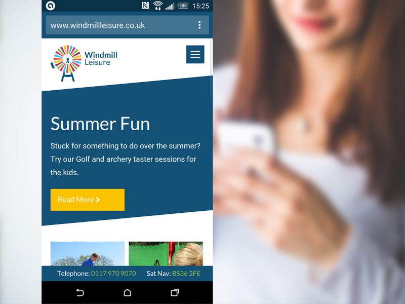
To do this, simply copy and paste this single line of code, changing the hexadecimal code to whichever colour you would like.
Theme-color options:
<meta name="theme-color" content="#FEC110">Conclusion
As the need for a mobile-friendly business website becomes more and more important (mobile website visits are now reported to account for over 50% of total US website visits – Mobile Marketing Statistics 2015 – Smart Insights) it is time to start thinking beyond just the basics of responsive web design.
These techniques are all fairly simple to add to your own website and will help to enhance the user experience on mobile and so take your business website ‘Beyond Responsive’.