Google talks mobile updates and “interstitials”
- 24th August 2016
- News
There’s no denying that Google has a lot of influence when it comes to websites and how they work for the user. With their latest Webmaster article they’ve announced two future ‘tweaks’ to improve their own user experience and the websites that are listed on mobile devices.
With the latest Webmaster Central Blog article Google have announced the removal of the mobile-friendly label in an attempt at simplifying mobile search results. They have also turned their attention to how a website treats its visiting users via the removal of interstitials (model pop up boxes for example).

Our reaction regarding the latter
So in a nutshell, what does this all mean?
Simplifying mobile search results
Two years ago Google added a mobile-friendly label to their mobile search results page in an attempt to bump up the volume of responsive websites to improve user experience on mobile devices. According to Google this update had a profound effect on the volume of websites catering to mobile.
…we recently found that 85% of all pages in the mobile search results now meet this criteria and show the mobile-friendly label.
With this statistic in mind, Google have now turned their attention to uncluttering their own user experience and removing the label entirely. It’s important to note that this will not have a direct impact on the ranking criteria – this appears to just be a visual update.
Okay, so not a ground-breaking update, but certainly an improvement. The mobile label has done its job and helped give an added bonus to responsive websites. Now this is essentially ‘the norm’, it’s no longer required.
Helping users find the content
The introduction of responsive websites brought with it some fairly clever methods of serving content on mobile. Unfortunately there are many websites out there that, instead of coming up with a subtle yet effective methods of attention grabbing content, have turned their efforts to intrusive pop ups (or interstitials – kudos to Google for teaching us a new word!) to get their message across.
Cue frustration from the user! The user is visiting your website for its content, not pop ups with disruptive behaviour! If you do this, you’re a bad person and you know who you are!
This is where we’re in agreement with Google’s decision to penalise pages with any instance of a problematic content starting January 10th, 2017.
Straight from Google, below are some examples of techniques that make content less accessible to a user:
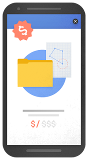
- Showing a popup that covers the main content, either immediately after the user navigates to a page from the search results, or while they are looking through the page.
- Displaying a standalone interstitial that the user has to dismiss before accessing the main content.
- Using a layout where the above-the-fold portion of the page appears similar to a standalone interstitial, but the original content has been inlined underneath the fold.
Examples of interstitials that make content less accessible

An example of an intrusive popup

An intrusive standalone interstitial

An intrusive standalone interstitial
So there we have it, the removal of the mobile-friendly label and the introduction of what we hope is the demise of intrusive pop ups! One thing we’re certainly interested in is how supported this decision is. Is Google trying too hard to influence websites?
Have you been affected by this pending update? Do you think Google have too much influence? We’d like to know your thoughts! Please do so using the comment feature below or tweet us.


