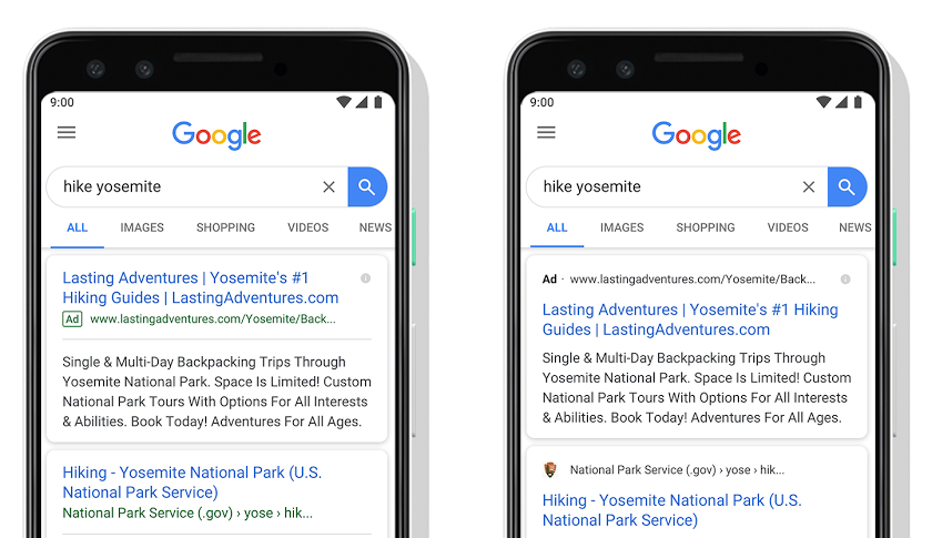
A new look for Google Search with Favicons
- 28th May 2019
- News
You may have recently noticed a subtle change on Google on your mobile recently – things are looking a little more modern!

The unveiled subtle visual refresh
Google have always promoted their search results to help people find information as quickly and easily as possible. It seems with their continuing effort to improve Search they’ve unveiled a subtle visual refresh for mobile users – the introduction of favicons to the results pages.
The reasoning behind this comes straight from Google:
With this new design, a website’s branding can be front and center, helping you better understand where the information is coming from and what pages have what you’re looking for.
Jamie Leach, Senior Interaction Designer, Search
So it seems there’s even more reason now than ever to ensure your website is at its best. From responsiveness and the overall design, accessibility and usability to the page load time and various optimisation techniques – and now even down to the finer details – favicons!

If you’re interested in getting your favicon under your search listing, you can learn more about how to choose your preferred icon for organic listings here. Alternatively, we’re more than happy to offer advice and guidance at no cost. Ping us a message on Facebook, Twitter or email directly.
What’s next?
Whether it’s for the best or not in the eyes of website owners but Google are adding more and more functionality to their search result pages – it seems extra functionality is heading our way with the addition of useful actions such as buying tickets to playing audio clips. Quicker and easier for the end user, perhaps not so great for website owners wanting visitors to engage within their pages.


